Sunday, March 10, 2013

AoA for Rayne Archer of Annan

Rayne

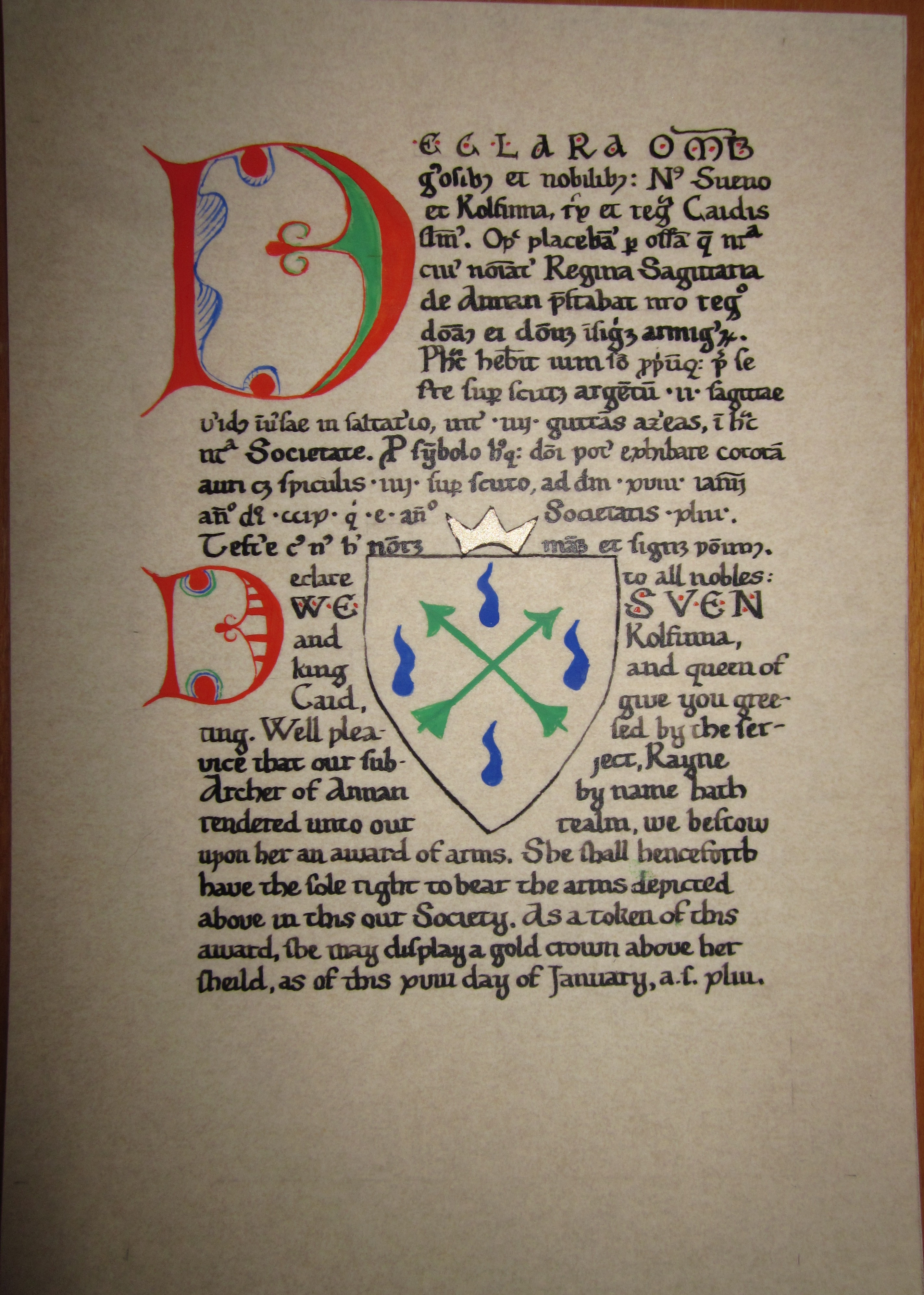
The scroll was done over the course of a week. On Mar. 5, I chose the exemplar, Codex Admontensis 58, fol. 87, and made all the changes to the Latin that I needed to personalize this for the submitter. I'm getting pretty good at Latin blazons, thanks to Introductio Ad Latinam Blasoniam, which Ursula pointed me to last week. I also sketched out the layout and the lines. On Mar. 6, I painted the initial. I knew there was no way I could recreate that pale yellow, so I decided not to try and substituted a pale green instead. I think the result still works. On Mar. 7, I started the calligraphy, getting through the end of the second sentence; unfortunately, I'd planned to curve the text around the D as it was in the exemplar, but since I didn't draw my lines that way, I forgot when I started the calligraphy, so they lines line up straight. It's time consuming having to look up the abbreviations to confirm my memory, but the result just looks so much better. Unabbreviated Latin just looks wrong. After I completed that day's calligraphy, I realized I had way more text than space, and so decided to fix this by putting the arms front and center, maybe adding another initial, and putting a gloss of the Latin text in in English. So Mar. 8, I sketched in the blank shield as a space saver, and then completed the Latin calligraphy (with impeccable line filling, if I say so myself). Since I then needed a second "D" from the same MS, I picked this one from fol. 6r, and then calligraphed the English. Mar. 10, I painted the arms, the crown, the final initial, and put dots around the capitals to match parts of the MS, and the results I'm quite happy with. I had expected this one to be rather plain, per my initial conception, but instead it's got lots of neat little bits.

The text is the standard Latin AoA scroll text for Caid, modified to correct the grammar ("Societas" is not a 1st declension feminine, people!) and reads:

Declara omnibus generosibus et nobilibus: Nos Sueno et Kolfinna, Rex et Regina Caidis salutamus. Optime placebamur per officia quae nostra civis nominatur Regina Sagittaria de Annan praestabat nostro regno donamus ei donum insignium armigerorum. Posthac habebit ium solum propriumque prae se ferre super scutum argentum, ii sagittae virides inversae in saltatario, inter iiij guttams azureas, in hac nostra Societate. Pro symbolo hujusque doni potest exhibare coronam auri cum spiculis iiij super scuto, ad diem xvii januarii Anno Domini ccix qui est xliii Anno Societatis Testare cujus Nos hic nostrum manum et signum ponimus.

I used abbreviations every single place I could, taking them primarily from Cappelli, though I paid no attention whatsoever to temporal consistency and blithely mixed centuries.

And here's the English gloss:

Declare to all nobles: We, Sven and Kolfinna, King and Queen of Caid, give you gree ting. Well pleased by the ser vice that Our subject, Rayne Archer of Annan by name, hath rendered unto Our Realm, We bestow upon her an Award of Arms. She shall henceforth have the sole right to bear the arms depicted above in this Our Society. As token of this award, she may display a gold crown above her shield, as of this xviii day of January, a.s. xlii.


© 2013, Sara L. Uckelman.

Monday, March 4, 2013

AoA for Ysabel d'Outre-mer

I learned recently that Caid has a huge scroll back-log, so I volunteered to help out. Unlike when I was working on the Drachenwald backlog, though, I'm going to limit my angst about re-using text, and instead focus on simple, elegant designs with a practiced text that I know roughly how much space it takes. No one will hold it against me if I repeat my wordings.

mellicensis 353Ysabel

The exemplar is Codex Mellicensis 353 (977), fol. 339. The text reads:

Gerhardt and Una, King and Queen of Caid, to the dukes, counts, earls, barons, and nobles of the realm: Greetings. By these presents let all know that following the will of our people and by our own wish and desire, and further more in recognition of the deeds she has done and the service she has rendered unto us, we are minded to elevate Ysabel d'Outre-mer to the rank of lady and award to her the sole and unique right to bear the arms Or, a cross fleury gules and on a chief vert, a crescent argent, which is depicted more plainly below, for her and her alone to bear in perpetuity. Done the xxv day of May, anno societatis xxxviii. in witness whereof we have signed our names below.

On the first day, Mar 2, I composed the text, chose the exemplar, sketched it out, lined the scroll, and sketched the arms. On the second day, Mar 3, I painted the base colors on the initial and the arms, and did the gold and white work on the initial. While I was mixing the brown for the initial, I complained to Ari about how difficult mixing brown is, and she pointed out that the original was probably entirely gold, and the dots tooling. Oh. In that case, I won't worry so much about mixing the brown to match the shade exactly. Oh well! I still think this looks cool as orange-blue-brown, though I'm sure orange-blue-gold would've been sharp. I did the calligraphy on Mar 4. Unfortunately, as I sat down to get started, I found that my favorite nib had bent, so I had to use a different one, and I struggled to get even flow the entire text. And then I smudged the gold paint on the crown, grrr. But then: then I did the detail work on the orange part of the G, and I am so, so happy with it. If you had told me three years ago, even a year or two ago, that I'd be able to paint something that has this leafy, three-D, shaded effect, I wouldn't have believed you. I'm still not sure I believe me. Go and check the exemplar and compare! So in the end, I'm pretty happy with this one!


© 2013, Sara L. Uckelman.

Thursday, February 28, 2013

Three blanks for Caid

My original idea for a contribution to Drachenwald's gift basket to Caid at Gulf Wars didn't materialize, but I wanted to send something, so I decided that blanks are always welcome -- especially to a kingdom that does almost all of their scrolls on commission because they have such a backlog.

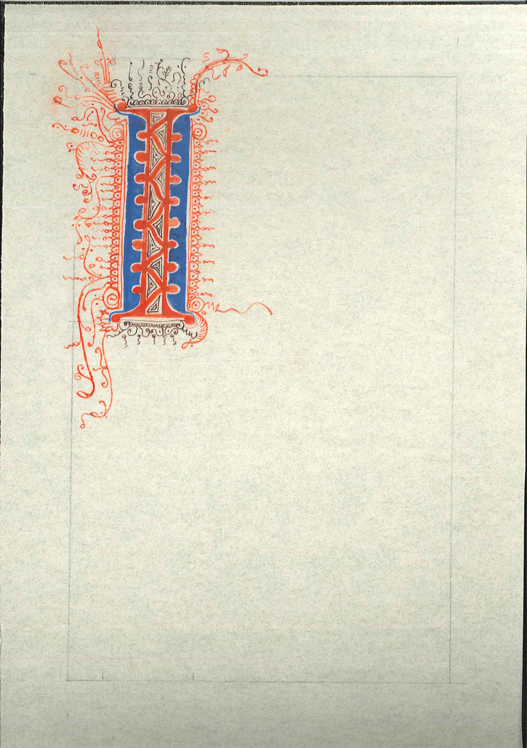
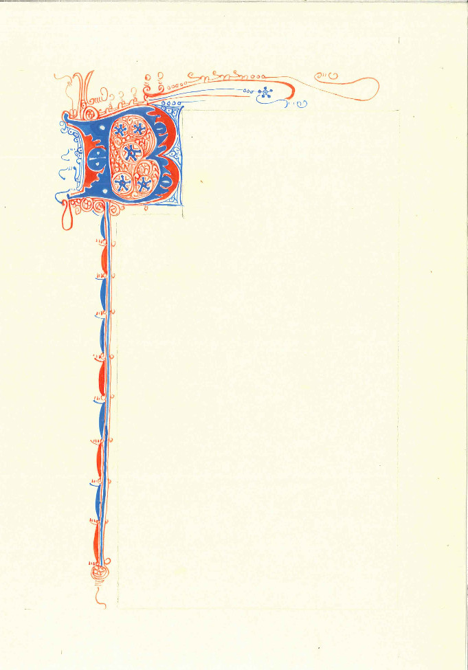
The first was based on BL MS Harley 3769, fol. 2. Unfortunately, the original was much neater than my rendition, though I'm not entirely sure where the blame is to lie.

blank   Harley 3769

I picked the initial, sketched the outline, and painted the skeleton (blue and red) on 26 Feb, and did all the flourishes Feb. 27.

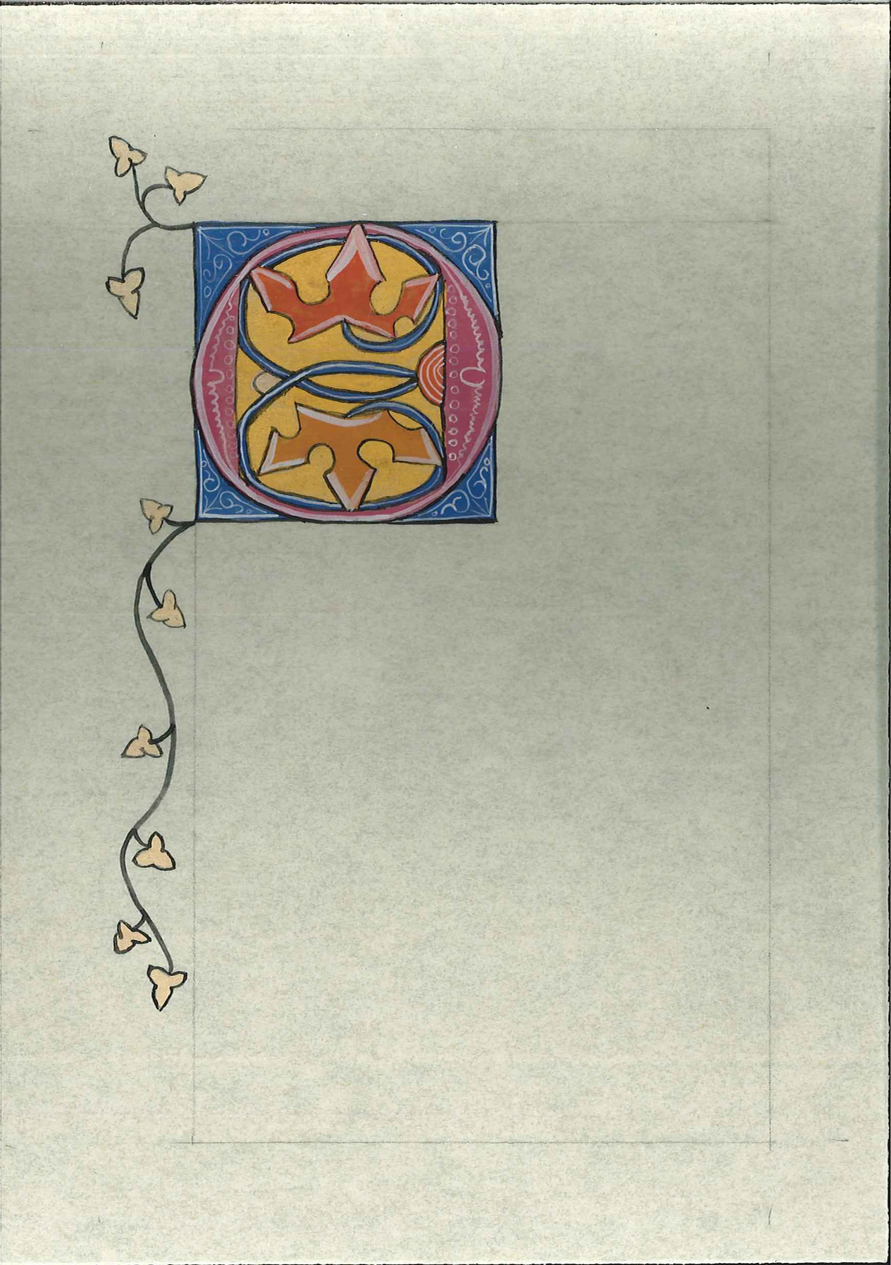
The second was based on BL MS Harley 4903, fol. 153v.

blank   Harley 4903

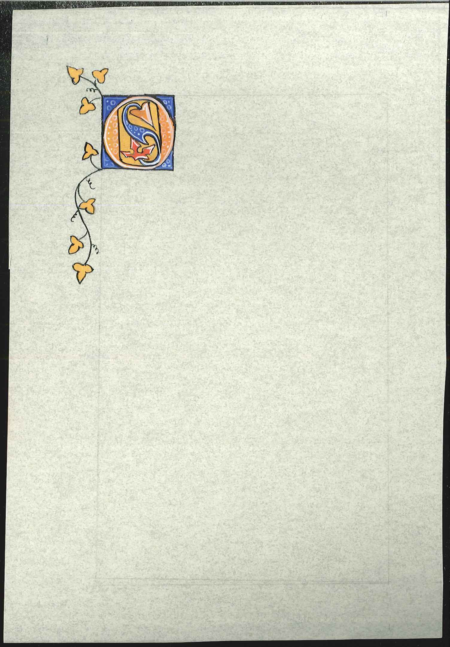
I picked the initial, sketched it, and painted the blue and the pink and orange inside the O on Feb. 27. The gold, white work, and black work were done 28 Feb. I like this one. As I did it, I was thinking that I'd like to do it again on a much smaller scale, about half the size, and maybe with real gold, instead of paint. Well, the real gold will have to wait until it is acquired, but I had some more free time Thursday night and so decided to do a smaller-scale version of a similar initial, from fol. 93:

blank   Harley 4903


© 2013, Sara L. Uckelman.

Sunday, February 24, 2013

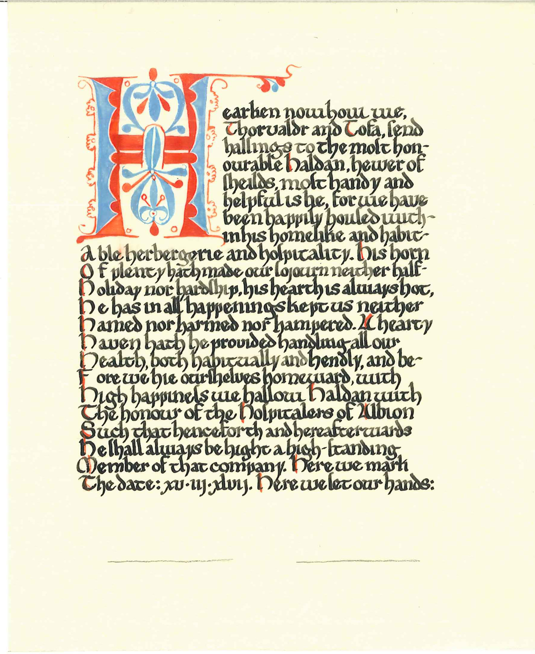
Hospitallers of Albion for Haldan Skjoldklifr

Haldan Harley 2621

The exemplar is BL MS Harley 2621 f. 1. The text reads:

Hearken now how we, Thorvaldr and Tofa, send halsings (1) to the most Honourable Haldan, hewer of shields, most handy and helpful is he, for we have been happily housed within his homelike and habitable herbergerie (2) and hospitality. His horn of plenty hath made our sojourn neither half-holiday nor hardship, his hearth is always hot, he has in all happenings kept us neither hamed (3) nor harmed nor hamperned. A hearty haven has he provided handling all our health, habitually and hendly (4), and before we hie ourselves homeward, with high happiness we hallow him with the honor of the Hospitalers of Albion such that henceforth and hereafterwards he shall always be hight a high-standing member of their company. Here we mark the date: xv.iii.xlvii. Here we set our hands:

124 words, of which 52 begin with "H". Unfortunately, I chose both the wrong nib and the wrong line-spacing, and thus the calligraphy is nothing to write home about. However, I'm relatively happy with the overall result. The color of the scan is also rather wonky, but I haven't figured out how to correct for this yet.

Notes:

  1. MED s.v. halsing(e): (2) 'greeting, salutation'.
  2. MED s.v. herbergerie: (a) 'A temporary lodging place; also, the tents or camp of an army in the field'’.
  3. MED s.v. hamed: 'restrained, hampered'.
  4. MED s.v. hendeli: (2)(a) 'humbly, meekly'; (b) 'beautifully, pleasantly'; (c) 'quickly, sharply'

© 2013, Sara L. Uckelman.

Thursday, February 21, 2013

Three blanks for Aarnimetsa

Next group of three to be finished in my blanks for regions project are three penwork initials for Aarnimetsä:

Blank 1Blank 2Blank 3
123
Arundel 325Burney 212Harley 666
BL MS Arundel 325 fol. 36BL MS Burney 212, fol. 14BL MS Harley 666, fol. 30

All three took about 1 hour a piece, and they were done Feb. 19, 20, and 21. I'm happiest with the first; the second has foliate fill which I'm bad at, but think turned out OK; the third I was actually quite unhappy with midway through but I think in the end it turned out OK, despite the, again, foliate fill that I don't like.

I picked the exemplars by flipping through my collection of printouts of puzzle initials from the BL, and found that I hadn't noted the citation for the "C". This isn't the only printout I have where I don't have a citation, so I decided once and for all to fix this, by going through all the hits in the BL simple search for "puzzle initial" and then indexing them. The index is available here: An Index of Puzzle Initials in the British Library Online.


© 2013, Sara L. Uckelman.
Monday, February 11, 2013

Three scroll blanks for ID

After I completed my 30 day challenge, I had an idea for my next one, but there was something I wanted to do in between.

Over the last 2.5 years as signet and then as Queen, I have benefited tremendously from the generous and amazing scribes of this kingdom, particularly in the supply of blanks, since I have always been a better calligrapher than illuminator, with the result that I have used far more blanks than I have produced -- especially in the last 6 months when Paul and I were laggardly in arranging our court lists!

So in return and as thanks and some small recompense, I decided to produce a set of three blanks each for the signets of Drachenwald, ID, Nordmark, Aarnimetsä, and also for my new home, Knights Crossing. They won't be flashy, they won't be fancy, but I hope they will be pretty and I hope they will be useful. The plan is to do each set of three in a matching style, but hopefully pick very different styles for each of the five.

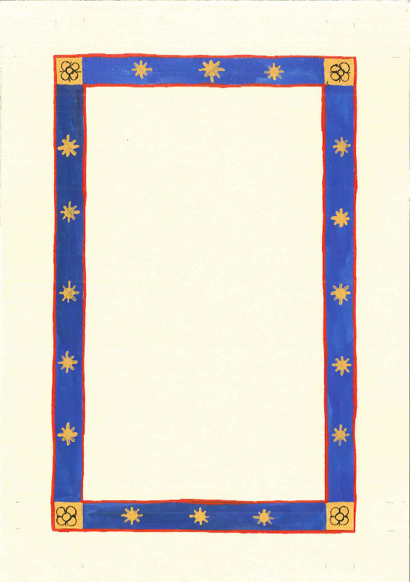
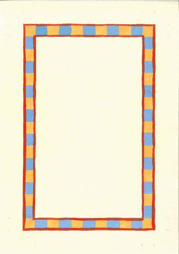
For ID, I picked borders from the Manesse Codex. Here are the three:

blankblankblank
Based on 13rBased on 158rBased on 120v

I used a different shade of blue in each one in an attempt to match the one in the MS. The final choice I think was the best.


© 2013, Sara L. Uckelman.
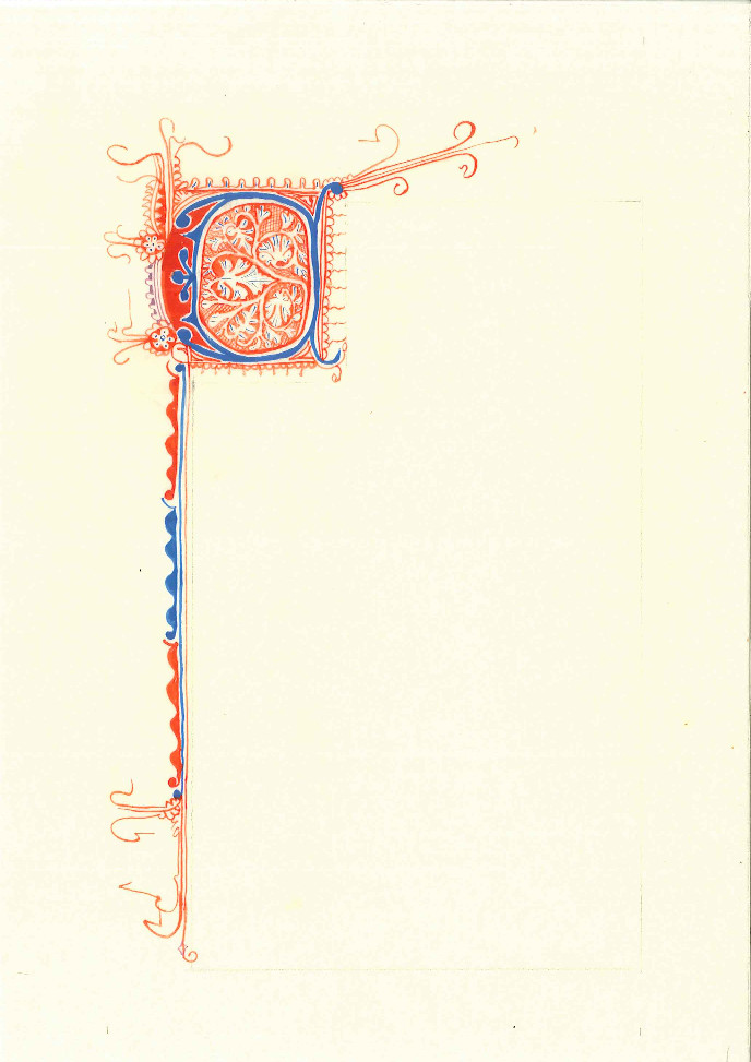
Friday, January 25, 2013

Sun and Chalice for Duncan Forbes

Duncan

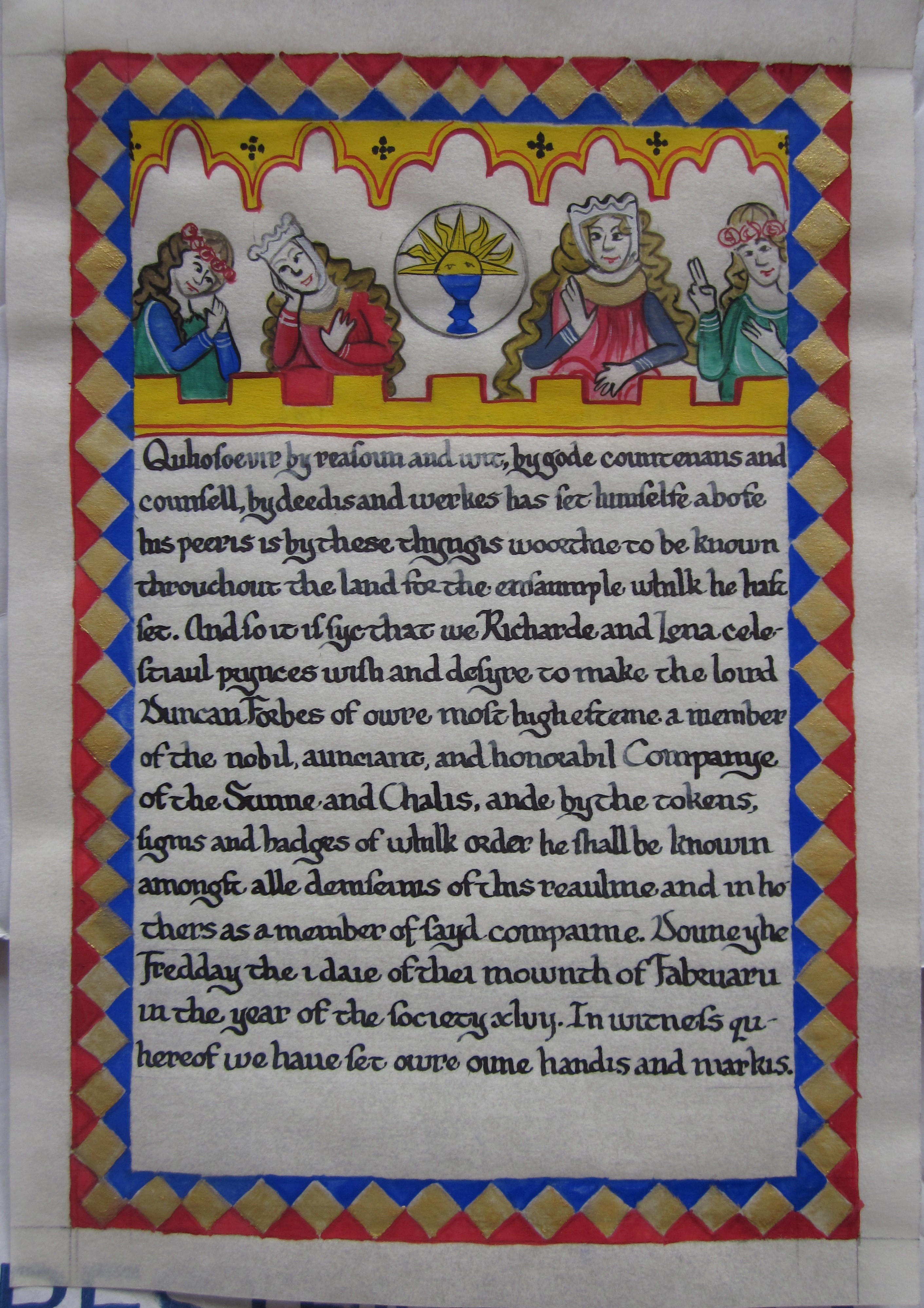
Done on a blank by Saraswati. The text is in an attempt at Scots, and reads:

Quhosoevir by reasoun and wit, by gud countenans and counsell, by deedis and werkes has set himselfe abofe his peeris is by these thyngis woorthie to be known throuchout the land for the ensaumple whilk he hast set. And so it is syc that we Richarde and Lena celestiaul princes wish and desyre to make the loird Duncan Forbes of owre most high esteme a member of the nobil, aunciant, and honorabil Companye of the Sunne and Challis, ande by the tokens sygnis and badges of whilk order he shall be knowin amongst alle deinseinis of this reaulme and in hothers as a member of the said compainie. Doun yhe Fredday the i day of thei mownth of Fabruarii in the year of the society xlvij. In witness quhereof we haue set owre oune handis and markis.


© 2013, Sara L. Uckelman.