At Double Wars this year, the Order of the Rose hosted a "Beauty and the Beast" cross-dressing contest. My contribution to the contest was illuminated cards for the winners. I volunteered to do these about a week before the event, so I couldn't do anything too elaborate, but I figured it'd be a good time to dig out a pretty, flowery B and a grotesque B for the respective winners.
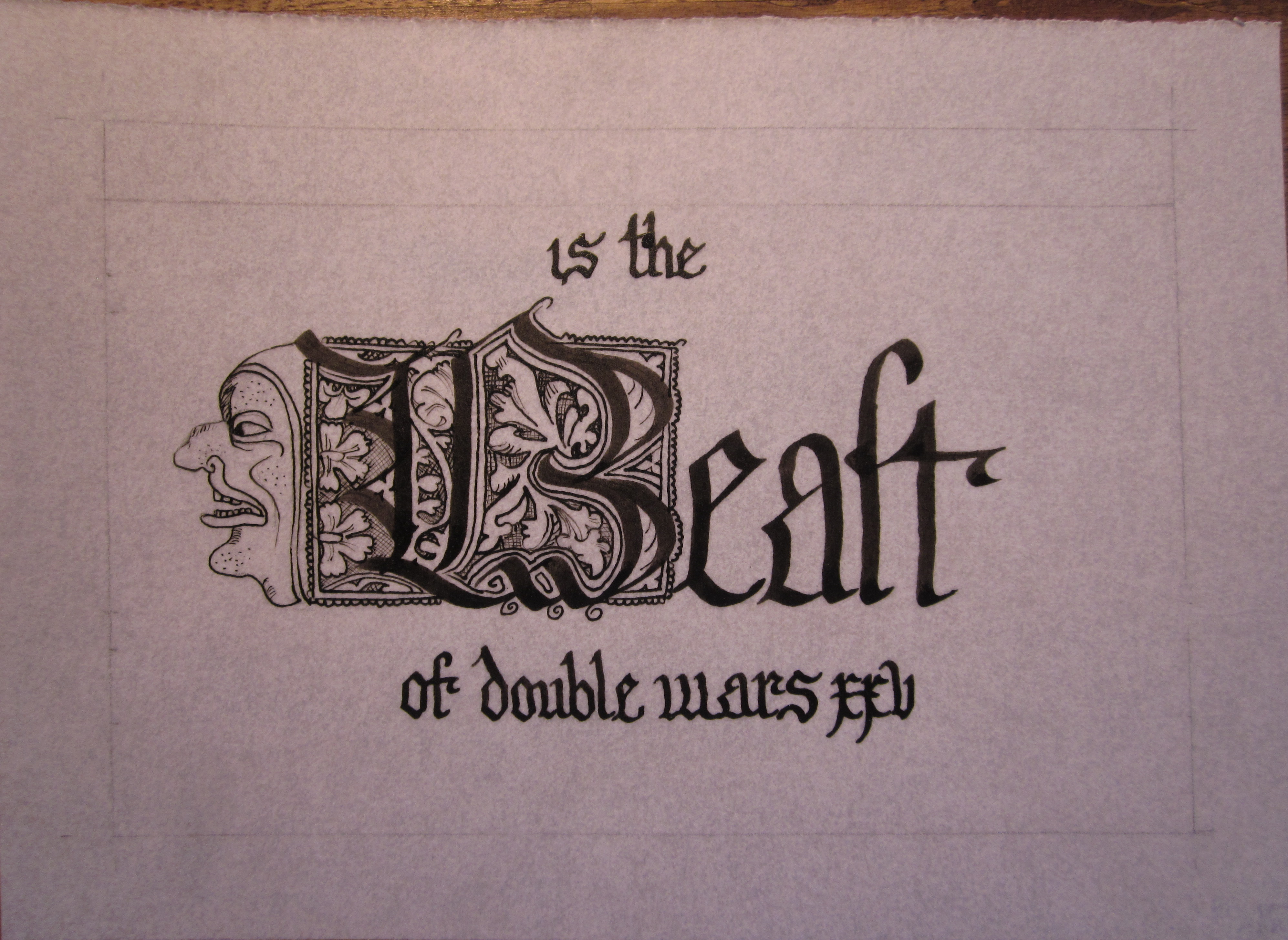
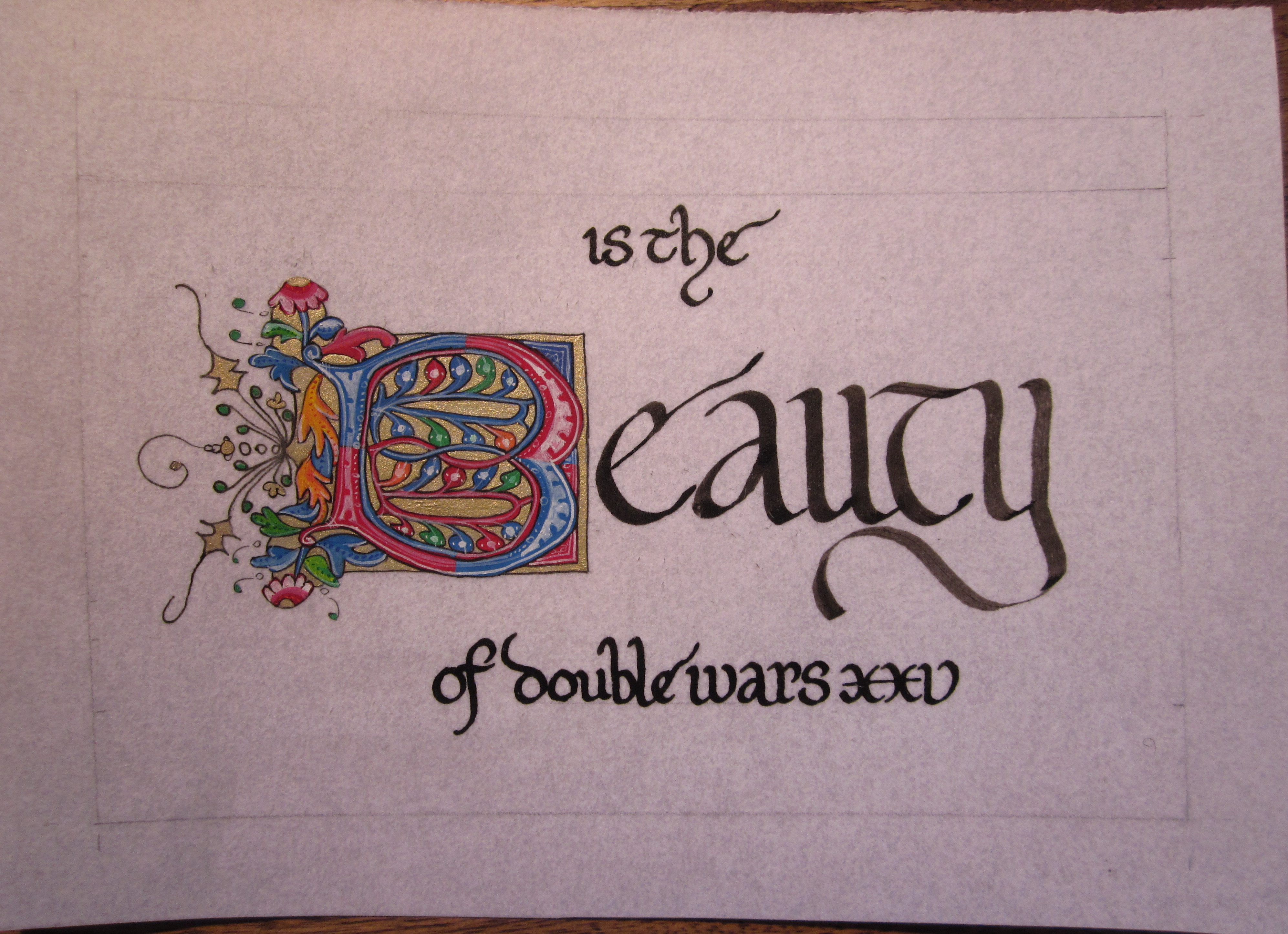
I picked the exemplars out on May 16. The exemplar for Beauty is Codex Gottwicensis 125 (115), f.83v. The exemplar for Beast is adapted from examples in the Macclesfield Alphabet. I didn't expect to find the Macclesfield letters to be so easy! I started the initial that evening, and quickly did the rest of the calligraphy and most of the initial, all except for the grotesque. It's all done in ink (Winsor & Newton's calligraphy ink), with three different size nibs (3mm, 1.5mm, and drawing tip, I believe), and took about 45-60 min. Love it!
May 17 I was able to sketch out the initial for Beauty while Gwen took her nap, and paint in the green. I painted the orange while she took her nap. May 18 she slept late and didn't take a nap, so I had to paint with her in the room...always a distraction. There was a spilled cup of water (on the floor thankfully) and a finger in the blue paint (then dragged onto the dress not so thankfully), but I did get the blue, carmine, and gold done with her supervision. I figured, "Oh, I have only the whitework and the black to do after she goes to bed". Yeah, and all the shading. Those bits alone took ~1.5 hours dedicated work. But the result made Joel go "Wow -- that's really good!" when it caught his eye, distracting him from his work. So, result!
I did the calligraphy for Beauty May 19; I had wanted something a bit more delicate and feminine, but my ink was glopping on me. It still looks nice. That left the grotesque for beast, which involved some practicing. The good thing about grotesques is that, almost by definition, they're basically impossible to screw up. This one isn't as nice as I might've wanted, but it fits well with the initial, and how could I have a card for the Beast that doesn't have a grotesque on it?
© 2014, Sara L. Uckelman.